Cosmetic Bags for Seniors: Easy-Grip & Accessibility Design
Executive Summary
Cosmetic bags for seniors should use inclusive features that make contents easier to identify, reach and return without defining older users by limitation. The clearest design combines high visual contrast, large easy-grip pulls, a smooth low-force zipper path, stable opening geometry and shallow visible storage. A bag about 24 × 16 × 9 cm can hold an everyday personal-care set without creating a deep search space. Tactile cues should distinguish the main opening from an internal pocket, while a light-to-mid-tone lining helps dark containers and tools stand out under varied lighting.
Accessibility is a measurable design discipline, not a claim based on age. Buyers can specify pull dimensions, opening force targets for comparison, edge contrast, pocket depth, label size and retrieval tasks, then test them with a varied user panel. No single colour, closure or grip works for everyone, so the product should offer redundant cues: shape plus texture, contrast plus clear language, and structure plus a broad opening. The goal is dignified independent use where possible, alongside an orderly layout that also benefits travellers, gift recipients and users of any age.
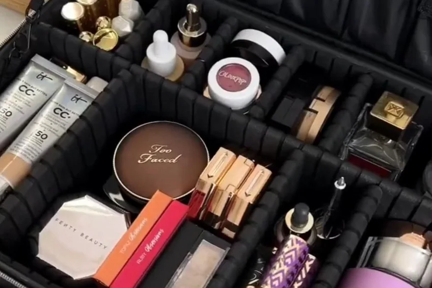
Inclusive cosmetic-bag design begins with tasks, not age-based assumptions
The relevant tasks are concrete: finding the opening, holding the bag steady, moving a slider, seeing the contents, identifying two similar pockets, retrieving a small item and closing the case without trapping fabric. Age alone does not predict how any person performs them. A respectful brief therefore avoids medical language and does not present older adults as one uniform group. It defines the use environment—home vanity, bathroom shelf, overnight visit or longer travel—and develops features that reduce unnecessary effort for a wide range of users.
Good accessibility uses more than one signal. A main zipper can have a large teardrop pull with raised ribs, while an internal pocket uses a shorter smooth tab. A dark exterior can open to a pale lining with dark pocket binding, so edges remain visible. A shallow compartment can combine elastic loops with one free zone, giving organisation without forcing every item into a narrow slot. These features also support users carrying glasses, operating the bag in weak hotel lighting or managing a rushed routine.
The bag should feel familiar rather than clinical. Soft-touch pulls, balanced proportions and attractive materials can coexist with functional contrast and legible labels. Avoid childish icons, patronising slogans and exaggerated claims such as universally easy or effortless. Instead, state the feature: 45 mm textured pull, wide U-shaped opening, contrasting pocket edge or stable 10 cm base. Specific descriptions help buyers compare samples and let shoppers decide whether the product suits their preferences.
Choice should remain visible in the design. Some users prefer a case that stays open on a vanity; others want a soft pouch that compresses into luggage. One style can offer removable dividers and a detachable shoulder-height hanging loop without forcing either feature into use. Instructions should explain options in plain language and readable type. This approach respects individual routines and avoids presenting one prescribed arrangement as the correct way for every older person to organise personal care.
Grip geometry, zipper path and base stability work as one mechanism
A larger pull improves access only when its shape and attachment support a natural grasp. A pull 40 to 55 mm long and 15 to 25 mm wide can be held between fingers or hooked with a finger, while a thin flat metal tab offers little contact area. A soft moulded pull with shallow ribs provides traction without sharp edges. A looped cord offers flexible access but can collapse against the bag, so a semi-rigid end tab or moulded sleeve helps it stand away from the zipper tape. The pull should not be so heavy that it drags the slider around the track.
Opening force comes from the full system: zipper gauge, slider fit, tape coating, seam alignment, curve radius, panel tension and packing pressure. A premium-looking coated zipper may run more heavily than an ordinary coil, especially around a tight 90-degree corner. Broad curves and twin sliders reduce travel distance. A fabric garage can conceal the slider end, but an overly tight garage makes the starting action harder. Buyers should compare force on filled samples, using the same opening speed and path, rather than judge an unfilled zipper by hand.
Precise component language supports useful corrective action. ASTM D2053 terminology for zippers distinguishes chain, slider, pull, stops and other parts. That vocabulary helps a specification state whether the issue is pull size, slider resistance, chain alignment or stop placement. The standard reference does not prove that a finished bag is accessible; user tasks and agreed comparative force checks remain necessary.
Stability lets the second hand rest rather than fight the bag. A base around 9 to 11 cm deep, a thin stiffener and a low centre of gravity keep the case upright as objects are removed. A non-slip patch can help on a smooth vanity, but it should be flush and easy to wipe. Side handles should sit near the centre of gravity and have 35 to 45 mm clearance from the body, allowing a hand to pass through without scraping the zipper. A wide top opening then exposes contents while the base remains planted.
| Access element | Design variable | Sample target | User task to observe | Common obstruction |
|---|---|---|---|---|
| Main zipper pull | Length, width, texture | 40-55 mm long; 15-25 mm wide | Locate, grasp and open from either end | Thin tab lies flat |
| Zipper track | Curve radius and panel tension | Broad rounded corners | Open a filled case smoothly | Tight corner binds |
| Carry handle | Clearance and balance | 35-45 mm hand clearance | Lift and set down level | Handle collapses against body |
| Base | Depth and stiffness | 9-11 cm with light stiffener | Remove an item without tipping | Tall bottles shift centre |
| Internal pocket | Pull differentiation | Short smooth tab | Identify without confusing main opening | Matching pulls feel identical |
- Evaluate the pull, slider, zipper path and packed pressure as one operating system.
- Use broad curves instead of forcing a coated zipper around sharp corners.
- Provide enough handle clearance for a hand to enter without pinching against the shell.
- Describe dimensions and tasks rather than making universal ease-of-use claims.
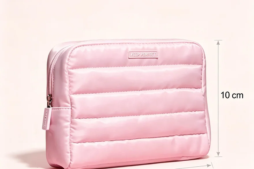
Contrast and tactile cues create a readable interior without visual clutter
Contrast works at boundaries. A pale lining alone does not help if the pocket edge, zipper tape and contents share the same tone. Dark binding around a light mesh pocket defines its opening; a bright but controlled zipper pull identifies the main access point; and a solid panel behind transparent mesh keeps the pocket from becoming visually noisy. Buyers should review the colour combinations under warm indoor light and lower illumination, not only beneath bright photography lights. Surface glare from glossy clear film can reduce visibility even when colour contrast is strong.
Colour should never be the only code. Pair a blue main pull with raised ribs, and pair a grey internal pull with a smooth oval shape. Add a stitched raised line at the top of the liquid pocket or use two distinct zipper-pull silhouettes. These cues help any user operating by touch or under poor lighting. They also make instructions simpler: open the large ribbed pull for the main compartment, then use the short smooth tab for the internal pocket. Avoid a forest of different symbols; two or three consistent cues are more learnable.
Pocket depth determines visibility. A 70 to 90 mm shallow mesh pocket is suitable for small tubes and personal items, while a 120 to 150 mm sleeve can hold a comb or brush. Very deep dark pockets hide contents and require rummaging. Elastic should retain objects without demanding a strong pinch to insert them. Broad 35 to 45 mm channels can accept varied bottle shapes, and an open tray zone accommodates containers that do not fit a loop. A removable divider with a large tab gives flexibility without a complex mechanism.
Colour durability matters because a high-contrast edge loses function if it transfers, fades or becomes dirty quickly. ISO 105 colour-fastness work provides standardised language for evaluating colour behaviour under relevant exposures. Buyers should select the applicable method and acceptance level for the textile and market. A wipe check with representative cosmetics remains useful for interior surfaces, since the goal is not only colour retention but continued legibility after realistic care.
Written labels should support, not replace, the physical layout. Short terms in clear type can identify liquids or small items, but long instructions hidden inside a pocket are difficult to use during packing. Keep essential care guidance on a separate readable card and use the interior only for brief orientation labels. Contrast between text and background, uncluttered placement and consistent wording matter more than decorative typography. Symbols should be explained rather than assumed to be universal.
| Information need | Visual cue | Tactile backup | Placement rule | Validation scene |
|---|---|---|---|---|
| Find main opening | Contrasting perimeter tape | Large ribbed pull | Top edge, visible when closed | Dim hotel room |
| Find internal pocket | Dark binding on pale lining | Short smooth tab | Upper pocket edge | Bag open on vanity |
| Separate liquids | Translucent light-blue panel | Raised stitched line | One side of main cavity | Contents partly filled |
| Locate small items | Light shallow mesh | Open upper edge | 70-90 mm pocket depth | Mixed dark and light objects |
| Identify carry handle | Contrasting handle underside | Padded oval grip | Centred over loaded base | Pick up from shelf |
Pair colour with texture or shape. A feature that remains understandable without perfect lighting is more robust for many users, not only for one age group.
User-centred evaluation turns accessibility language into evidence
A useful evaluation begins with tasks and comparable samples. Ask participants to locate the main opening, open a filled bag, identify a specified pocket, retrieve a small tube, return it and carry the bag to another surface. Observe grip changes, stabilising actions, snagging and errors without coaching the first attempt. Include people with varied hand sizes, visual preferences and travel habits rather than selecting a group only by age. Record where the design creates unnecessary effort, then adjust geometry before debating marketing language.
Force can be compared even when the programme does not claim a formal accessibility threshold. Use the same filled object set, zipper path and pull direction, then record peak and running force with a suitable gauge under a written method. The value is comparative: sample B may run more consistently than sample A around the same corner. It should not become a medical suitability claim. Repeat after normal handling and check both sliders, because alignment differences can cause one side to feel different from the other.
Inspection translates design intent into repeatability. Pull length, handle clearance, pocket depth, contrast placement and zipper path can be measured. Slider function, tipping and tactile differentiation require functional checks. Final inspection at AQL 2.5 under ISO 2859-1 sampling procedures should use an agreed defect list: a blocked zipper, detached pull or wrong contrast component affects use and should not be reduced to a cosmetic fault. Retain a signed reference sample for hand-feel and colour relationships that drawings cannot fully capture.
Respectful merchandising states choices without speaking down to the customer. Use phrases such as large textured pull, high-contrast interior, shallow visible pockets and stable base. Avoid frailty narratives, medical promises and images that treat older adults only as recipients of assistance. Show independent packing and travel alongside shared use where relevant. The same features can be presented as inclusive convenience for multiple generations, allowing retailers to place the product in travel, beauty organisation or thoughtful-gift assortments without hiding its accessible design purpose.
Packaging must continue the same approach. A readable feature card can show pull dimensions and compartment cues with plain diagrams, while the bag remains visible or touchable where retail format permits. Dense copy, pale text and glossy glare can undermine an otherwise clear product. The card should invite comparison and personal choice, not announce that a purchaser needs help. Consistency between package language and the physical sample is part of honest accessible merchandising.
| Evaluation task | What to record | Pass criterion style | Design lever if difficult | Claim boundary |
|---|---|---|---|---|
| Find main zipper | Time, wrong-pocket attempts | Main opening identified without instruction | Contrast plus ribbed pull | No promise for every user |
| Open filled case | Peak resistance, snags, grip changes | Smooth travel through full path | Curve radius and slider fit | Comparative force only |
| Retrieve small tube | Rummaging and visibility | Item visible and reachable | Pocket depth and lining contrast | No medical outcome |
| Set bag on vanity | Tipping and sliding | Stable during normal retrieval | Base depth and balance | Not a fall-prevention device |
| Carry between surfaces | Handle clearance and level | Hand enters and bag stays balanced | Handle stand-off and anchor position | No universal comfort claim |
- Recruit a varied user panel and observe unprompted tasks on filled samples.
- Use comparative force measurements to improve consistency, not to imply medical suitability.
- Classify missing tactile cues or wrong contrast components as functional defects when they affect the approved design.
- Market the tangible feature and its purpose without patronising narratives.
The B2B Customisation View
Programme planning for cosmetic bags starts with the end market: a hotel amenity run and a beauty-retail launch ask for completely different construction and compliance evidence.
Planning figures used across the programme: MOQ 500 pieces per style and colourway, 6–10 working days sampling (12–15 when moulding or multi-layer lamination is required), 35–50 days bulk lead time, AQL 2.5 to ISO 2859-1, FOB Xiamen, T/T 30/70.
The programme-management model exists because most import problems are documentation problems, and documentation is what this office produces and holds.
Which Brand Types Benefit Most
Start-up inclusive-design brands can focus on one well-tested medium case with two pull textures and a high-contrast interior instead of multiplying unvalidated features. Established beauty or travel brands can adapt recognised colours and materials while increasing handle clearance, simplifying pocket depth and improving zipper geometry. Retailers should let shoppers handle a filled display sample; e-commerce sellers need close views of pull dimensions, pocket edges, opening angle and internal contrast under ordinary light. Gift and hospitality buyers can choose restrained decoration and a large-print information card, but the permanent product should remain attractive outside a gifting occasion. Assortments should not isolate the style as a medical object: inclusive convenience can be merchandised for older adults while remaining useful across generations.
The order minimum is 500 pieces per style and colourway. Standard soft designs sample in 6-10 working days; complex constructions with custom moulded pulls or structured opening frames take 12-15 working days. Bulk production takes 35-50 days after sample approval. Inspection is AQL 2.5 under ISO 2859-1, shipment is FOB Xiamen, and payment is T/T 30 deposit, 70 against bill of lading. Before approval, lock the pull drawing, zipper path, comparative force method, contrast references, pocket depths, handle clearance and packed-object set. A physical reference sample is particularly important because grip texture and slider feel cannot be controlled adequately through colour codes and two-dimensional drawings alone.
Post-launch review should separate preference from functional inconsistency. One shopper may favour a softer handle while several reports of a binding corner point to zipper-path control. Collect feedback on the task, packed load, lighting and compartment involved, then compare it with the signed reference sample. Changes to pull texture, contrast or pocket depth should return to a varied user panel before adoption, preserving evidence instead of relying on assumptions about age.
Frequently Asked Questions
What makes a cosmetic bag easier to open for an older user?
A large textured pull, broad zipper curves, aligned tape, moderate panel tension and a stable base work together. Pull size alone cannot correct a binding slider or an overfilled case. A two-slider layout reduces travel distance, while a 40 to 55 mm pull offers more contact area than a thin tab. Evaluate the filled bag with varied users and describe the specific features rather than promising effortless use for everyone.
How large should an easy-grip zipper pull be?
A useful prototype range is about 40 to 55 mm long and 15 to 25 mm wide, with rounded edges and shallow texture. The final size depends on bag scale, slider strength and whether the pull is pinched or hooked by a finger. It should stand clear of the body without becoming so heavy that it moves the slider. Test attachment security and both wet- and dry-hand operation.
Which zipper path supports low-force opening?
A smooth coil zipper following broad rounded corners generally operates more consistently than a stiff coated zipper forced around sharp angles. Good seam alignment and balanced panel tension are equally important. Twin sliders can shorten the movement required. Buyers should compare filled samples under the same written method, recording resistance around curves and at the zipper garage instead of relying on an undefined low-force claim.
Why should colour contrast be paired with texture?
Lighting, glare, colour perception and personal preference vary, so colour alone can fail as an information cue. Pair a contrasting main pull with ribs and an internal pull with a smooth shape. A dark pocket edge against pale lining can also use a raised seam. Redundant visual and tactile information helps more users identify parts without turning the bag into a cluttered set of symbols.
How deep should visible internal pockets be?
A shallow mesh pocket around 70 to 90 mm deep works for small tubes and personal items, while a 120 to 150 mm sleeve can hold a comb or brush. Depth should follow the object plan, leaving the top of each item visible. Very deep pockets create a search space. Broad elastic channels and one open tray zone accommodate irregular containers without requiring strong pinching or precise alignment.
What base design keeps an accessible toiletry case stable?
A 9 to 11 cm deep base with a light stiffener and balanced object layout can keep a medium case upright during retrieval. Put tall or heavy bottles near the centre rather than at an outer wall. A flush non-slip patch may help on a smooth vanity if it remains easy to clean. Stability should be observed on a filled sample; an empty bag gives little evidence about tipping.
How should tactile zipper cues differ between compartments?
Give the main opening a large ribbed or teardrop pull and use a shorter smooth oval tab for an internal pocket. The distinction should be obvious without requiring fine texture discrimination. Keep the system consistent across colourways and explain it with simple product imagery. Avoid multiple decorative textures that compete. Pulls must also be securely attached and free from sharp edges or narrow pinch points.
Which interior colours improve visibility without looking clinical?
Warm ivory, sand, pale blue or light grey can contrast with dark containers while retaining a refined appearance. Define dark pocket edges or zipper tape against the lighter field. Avoid highly glossy film where glare obscures contents, and avoid pure white if routine staining would dominate. Review the complete palette under warm indoor light, lower light and product-photography conditions before selecting the reference sample.
When is a clamshell better than a top-opening accessible bag?
A clamshell gives the clearest overview when a broad vanity or bed surface is available. A top-opening box occupies less area and keeps bottles upright, but short objects may hide. A restricted clamshell with side gussets can stop contents spilling and hold the lid near 110 degrees. The better choice follows the use environment and the user's preferred reach pattern, not age alone.
What minimum applies to a high-contrast cosmetic bag colourway?
The minimum is 500 pieces per style and colourway. Contrast combinations are part of the function, so a navy shell with ivory lining and a taupe shell with pale blue lining are separate colourways requiring 500 pieces each. Keep the first palette focused. Each combination needs an approved reference because zipper tape, binding, mesh and lining must preserve the intended edge visibility.
How long does a custom easy-grip design take to sample?
A standard soft case takes 6-10 working days to sample. A complex style with a custom moulded pull, structured opening frame or several tactile components needs 12-15 working days. Bulk production is 35-50 days after sample approval. Sampling review should include filled opening tasks and comparative force checks; approving only colour and dimensions would miss the feature that defines the design.
What accessibility features should final inspection verify?
Inspection should verify pull dimensions and attachment, tactile differentiation, correct contrast parts, pocket depth, handle clearance, base stability and smooth zipper operation. Use the approved packed-object set for functional checks. Final inspection follows AQL 2.5 under ISO 2859-1. The defect list should treat a missing tactile pull or wrong low-contrast binding as functional when it changes the approved user experience.
Why should accessible cosmetic-bag copy avoid medical claims?
The bag can improve visibility, grip area, organisation and access, but it does not diagnose, treat or compensate for a medical condition. Users also vary widely. Specific feature descriptions are more respectful and more useful: large ribbed pull, broad opening, high-contrast pocket edge and stable base. Avoid universal claims such as suitable for every senior or guaranteed painless opening unless evidence and the legal basis genuinely support them.
How can brands test inclusive design respectfully?
Recruit participants with varied ages, hand sizes, visual preferences and travel habits, explain the practical tasks and observe without assuming difficulty. Ask what worked and what created friction. Compensate participants under the research plan and avoid framing older adults as a problem to be solved. Use findings to alter geometry, contrast and instructions, then retest the filled sample before final approval.
People Also Ask
What is an accessible cosmetic bag?
An accessible cosmetic bag uses tangible features that reduce unnecessary effort and make information clearer, such as a large textured pull, smooth curved zipper path, stable base, high-contrast lining, tactile compartment cues and shallow visible pockets. Accessibility should be evaluated through realistic user tasks. It is not a universal certification or a medical claim, and no single feature works for every person.
Are large zipper pulls better for seniors?
Large pulls can provide more grip area and stand farther from the bag, but performance depends on shape, texture, attachment and the zipper system. A large pull cannot fix tight corners or poor slider alignment. Prototype dimensions around 40 to 55 mm long, then test filled samples with varied users. Product copy should state the dimensions and texture rather than assume that every older adult has the same preference.
What colour lining makes cosmetics easier to see?
A light-to-mid-tone lining such as warm grey, sand or pale blue often makes dark caps and tools more visible. Add a darker pocket edge so boundaries remain clear, and pair colour with tactile cues. Avoid glossy surfaces that create glare and very deep pockets that hide objects. Review the palette under realistic indoor light because studio lighting can make weak contrast appear stronger than it is.
How do you test a low-force zipper on a toiletry bag?
Use the same filled object set, pull direction, opening speed and path for each sample, then record peak and running force with a suitable gauge under a written comparative method. Observe binding around curves and at the end garage. Repeat both sliders after normal handling. Results can guide design choices, but they should not be converted into medical suitability or universal ease claims without a relevant standard and evidence.
Request a Sample or a Written Quotation
Send the silhouette, dimensions, material preference and logo artwork, and the programme team will return a written quotation with MOQ, sampling window, bulk lead time and inspection standard.
Email: [email protected] · WhatsApp: +86 177 5002 0688